Manufacturer: Microsoft
What is the Microsoft Band 2?
The Band 2 is Microsoft’s second serious stab at the consumer wearable market. It aims to offer fitness fanatics a cross-platform tracker that will monitor everything from marathon runs to casual golf games.
As trackers go it generally achieves this goal, and is one of the better cross-platform wearables out there. But niggling flaws in its design and software, coupled with its hefty price tag, hinder its overall appeal.
Related: Best fitness trackers 2015
image: http://img.worldinout.com/img/201512/15/131750414.jpg
Microsoft Band 2 – Design
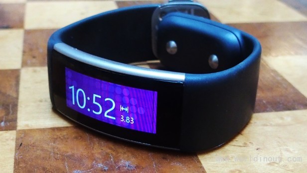
From the front you’d be forgiven for thinking the Band 2 looks all but identical to the original Microsoft Band. However, if you look at it up-close there are a few important design changes. The biggest of these is the battery’s migration to the strap’s bottom clasp. The first Band slightly awkwardly placed the battery on the underside of the smartwatch – making it slightly uncomfortable and awkward to wear.
Its new position means that the smartwatch's main body no longer painfully juts against the top of your wrist at certain angles.
However, it doesn't deal with the issue entirely: even though it's an improvement, problems remain. The placement makes the bottom clasp far more chunkier than most smartwatches, and prone to banging against my desk when typing. It also gets caught on loose threads when I put on jumpers and jackets. Within days of using the Band 2, the rear clasp was covered in scratch marks.
image: http://img.worldinout.com/img/201512/15/131750434.jpg
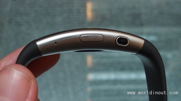
The Band 2’s 12.8 x 32mm body is still also a little awkwardly shaped. While it does have a slight curve, it still doesn’t sit quite right on the wrist, and at certain angles can pinch and dig into skin – especially when doing exercises such as push ups and free weights.
I’m also a little sad that the Band 2 isn’t waterproof. Microsoft’s has instead designed it to be dust- and splash-resistant. As a result, you can’t go swimming with it, or take it into the shower after a long work out – which means you’ll have to do a manual wipe-down after each exercise session to keep it looking and smelling nice.
Outside of these issues, the Band 2 has a pleasingly unique and robust design, and the metal used feels reasonably premium. On a purely aesthetic basis, the Band 2 is one of only a select few wearables that I’d be happy to wear on a day-by-day basis.
Microsoft Band 2 – Display
Of all the trackers I’ve tested, the Band 2’s AMOLED touchscreen is one of the best. The AMOLED tech lets the tiny screen produce deeper, inkier blacks than most trackers, which have a tendency to use the competing IPS screen tech. The deep blacks help make colours stand out and give the Band 2’s screen a pleasingly punchy look.
The 320 x 128 resolution is also pretty good, and means text and icons on the screen look suitably sharp.
Rounding it off, the maximum brightness is high enough to ensure the Band 2 remains usable in all but direct sunlight – so you won’t struggle to check your heart rate mid-run or scroll through incoming messages while you’re out and about.
image: http://img.worldinout.com/img/201512/15/131750414.jpg

My only quibble with the screen stems from its atypical rectangular dimensions. The result is that the Band 2 doesn’t have enough screen real estate to display incoming alerts in portrait.
The fact that it’s locked to display content in landscape makes the Band 2 difficult use compared to most wearables. Even carrying out basic tasks such as checking the time requires you to hold your wrist at a slightly awkward angle; checking your progress while running involves you having to uncomfortably tilt your head.
Related: Best smartwatches 2015
Microsoft Band 2 – Software
The Band 2 works on Android, iOS and Windows Phone/Windows 10 Mobile. I tested it using a Nexus 5X and Lumia 950 XL. The setup process is fairly simple. All you have to do is to turn on your smartphone’s Bluetooth and install the Microsoft Health app.
From there you simply enter your date of birth, height and weight, and follow a series of on-screen commands to pair the two devices.
When paired the smartwatch will automatically track how many steps you take and push calendar, alarm, email and incoming phone call alerts. It has a similar tiled interface to Windows 10 Mobile. This is no bad thing – the interface is one of the most intuitive I’ve seen on a wearable.
There’s also the option to add Live Tiles for specific commonly used services and third-party applications in the Settings menu. Out of the box, these include optional tiles for apps such as Facebook Messenger, Twitter and Starbucks.
More advanced users can create or download specific workout regimes that mix and match various exercises – these include options for more common exercises, such as squats, as well as cardio and weightlifting.


